
Media Statistics
The Media Statistics function displays your entire transmission traffic within a specific timeframe. This enables you to see up-to-date data developments on your usage of Retarus services within a timeframe of your choice, detect potential preferences, and draw conclusions about your communications volume. You can display information regarding your fax, SMS, and email traffic.
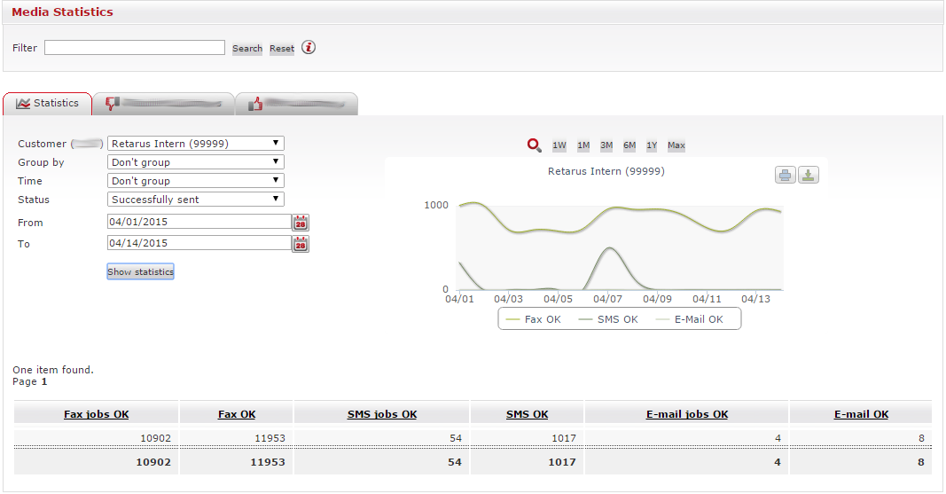
If you have more than one customer number, select the one. Set the timeframe for which you want to display the Media Statistics. To do this, click on the calendar symbol in the From row (![]() ) and select the start time. The end of the timeframe is selected in the To field.
) and select the start time. The end of the timeframe is selected in the To field.
You can decide the categories under which the information is grouped. If you do not select a specific grouping, the total number of sent messages, emails, and SMS is displayed separately. In addition, you can configure whether the total number of sent messages is shown or just the number of messages that were successfully sent. If you select All, in the Status field, the graphic will display failed transmission data using red bars. You can, for example, determine the success rate for broadcasts and pinpoint errors due to inaccurate addresses. In the graphic, errors are displayed in red and cancelled transmissions in orange. The corresponding columns in the table are populated.
To display the analysis, click on the Show statistics button. You also have the option of downloading the data by clicking on the ![]() icon. A pop-up window opens with buttons for opening and saving the CSV file.
icon. A pop-up window opens with buttons for opening and saving the CSV file.
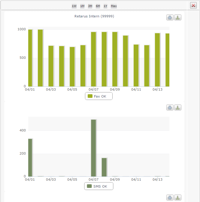
The image next to the input mask is enlarged by clicking on the ![]() icon. You then see all of the grouped data separately displayed in individual graphs.
icon. You then see all of the grouped data separately displayed in individual graphs.
The images can be printed by clicking on the ![]() icon. Click on the
icon. Click on the ![]() icon to save the image locally. To close this view, click on the
icon to save the image locally. To close this view, click on the ![]() icon in the upper right-hand corner of the pop-up window.
icon in the upper right-hand corner of the pop-up window.
In addition to graphic analysis, you get a detailed analysis of your communications traffic. The data may be presented differently depending on the applicable selection criteria. The following example displays the data selected above from a purely chronological standpoint:
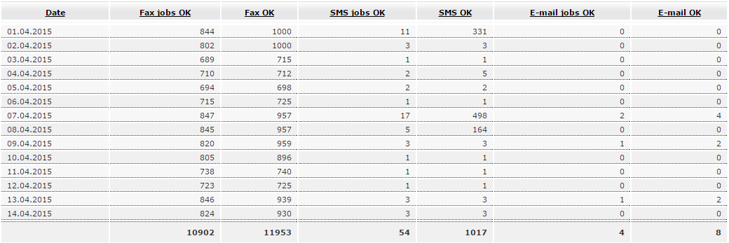
In the above example, data is grouped by date: the number of faxes, SMS, and emails sent between April 1st and 14th are displayed. Fax jobs OK refers to the entire job, which may have consisted of multiple faxes, whereas the Fax OK column refers to the total number of faxed pages. The SMS and email columns also differentiate between jobs and the total number of SMS/emails sent because you can send an SMS or email to multiple recipients.
You also have the option of grouping the results by the Retarus service used to send the transmission. This is especially useful when you are viewing company-wide communications patterns and want to discern the intensity with which individual services are used.
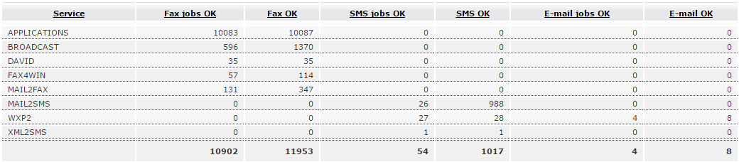
The table displayed here shows the services and the extent of their usage: Fax-for-Applications, Email-to-Fax, Email-to-SMS, WebExpress, and so on. The bottom row displays the sum for each medium within the selected timeframe.