The Transactional Email dashboard delivers a real-time overview of your email traffic, allowing you to:
-
Monitor overall delivery performance for submitted emails.
-
Identify issues, including hard bounces, soft bounces, and dropped messages.
-
Detect unusual patterns or sudden drops in performance across various time intervals.
-
Access detailed insights quickly using linked tools such as Live Search or Reporting.
The dashboard supports both operational monitoring and proactive issue detection, helping you maintain high deliverability and a strong sender reputation.
The dashboard uses a set of shared components and interactions consistent across all Retarus products. For general information about chart controls and visualization features, refer to Working with charts.
Dashboard layout overview
The dashboard consists of several key areas:
-
Timeframe selection and auto-refresh controls at the top
-
Transactions Overview panel with high-level status cards
-
Hard Bounce Events panel for bounce classification
-
Transactional Email–specific charts (Delivery Rate %, Message Rate)
Timeframe and auto-refresh
You can adjust the displayed timeframe using either quick ranges or a custom date and time range. Auto-refresh is available when a quick range is selected, ensuring that your data updates continuously during active sending periods.
For detailed information on timeframe controls and auto-refresh behavior, see Working with charts.
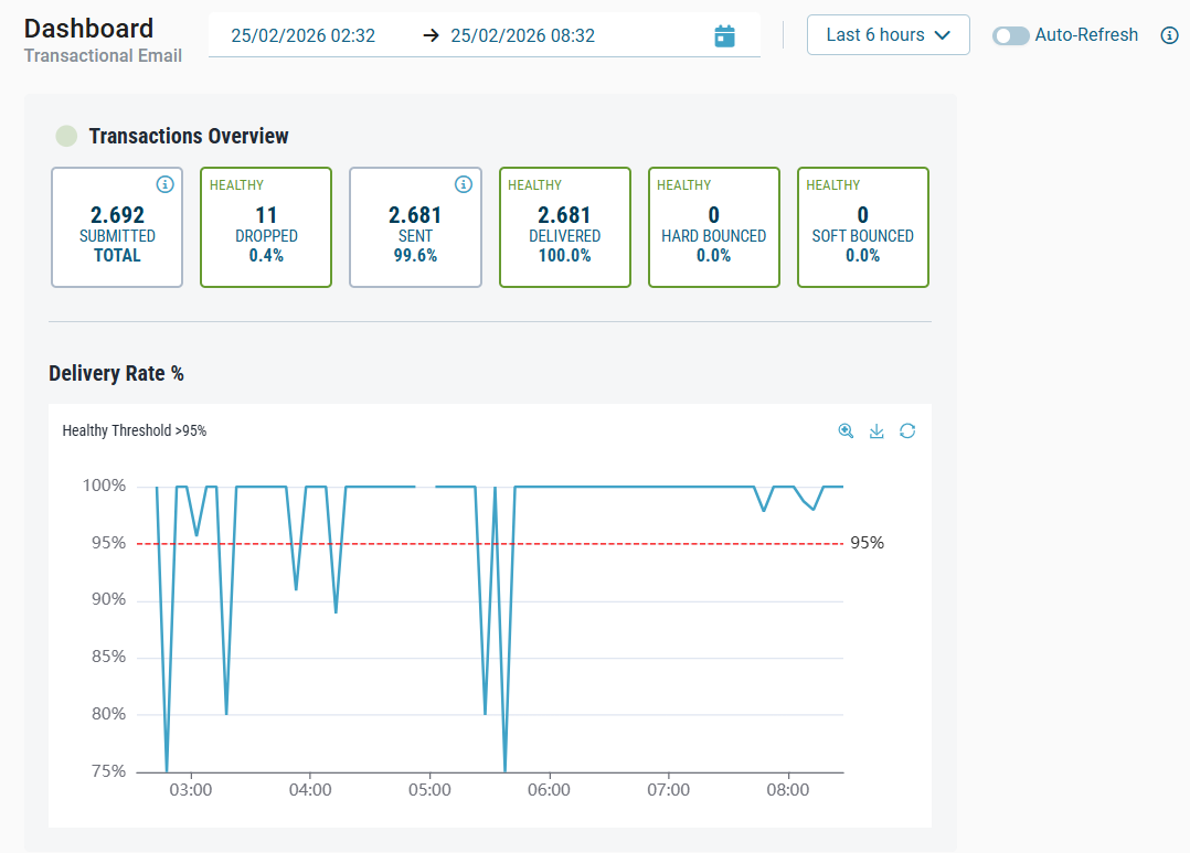
Transactions Overview
The Transactions Overview panel summarizes the lifecycle of your submitted emails within the selected timeframe. Each status is shown as a metric card that displays the total count and a percentage value.
Cards definition
|
Card |
Description |
Percentage relation |
|---|---|---|
|
Submitted Total |
Emails successfully received and accepted for processing. Each message is tracked from this point until it reaches a final status. |
— |
|
Dropped |
Messages removed during processing before being sent—often due to suppression list rules. |
|
|
Sent |
Emails processed and sent out by the Transactional Email service. |
|
|
Delivered |
Emails successfully delivered to the recipient’s server. |
|
|
Hard Bounced |
Emails permanently undeliverable due to issues such as invalid addresses or recipient server rejection. |
|
|
Soft Bounced |
Emails temporarily undeliverable and classified as final soft bounces after several attempts. |
|
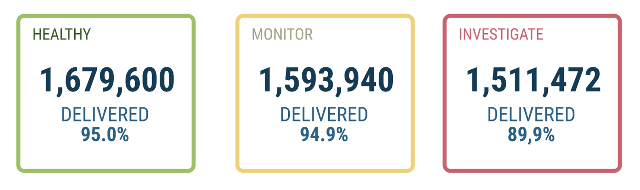
Cards thresholds
To help monitor deliverability, certain metric cards include visual alerts. Colors and labels indicate whether values fall within typical industry ranges.
|
Card |
Healthy |
Monitor |
Investigate |
|---|---|---|---|
|
Dropped |
< 2% |
2% – 5%
|
> 5%
|
|
Delivered |
> 97% |
95% – 97%
|
< 95%
|
|
Hard Bounced |
< 2% |
2% – 5%
|
> 5%
|
|
Soft Bounced |
< 2% |
2% – 5%
|
> 5%
|
Hard Bounce Events
The Hard Bounce Events panel shows the specific causes of hard-bounced emails. Hard bounces are permanent delivery failures that typically indicate issues with the recipient address or domain configuration.
The panel categorizes messages by common hard bounce reasons, helping you quickly identify delivery problems. Click any hard bounce card to view the prefiltered Reporting for that SMTP status code.
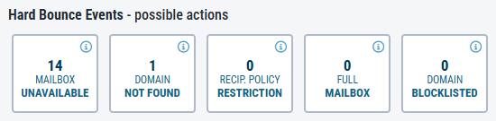
|
Status |
Description and possible actions |
SMTP status code |
|---|---|---|
|
Mailbox unavailable |
Invalid or disabled email addresses. Remove them from your Sending List. |
550 |
|
Domain not found |
Recipient domain unrecognized. Check domain syntax. |
500 |
|
Recipient policy restriction |
Transaction failed due to local policy or restriction. Review the SMTP response codes from the recipient servers. |
554 |
|
Full mailbox |
The recipient's mailbox is full and cannot accept more emails. Reduce the message size or retry later. |
552 |
|
Domain blocklisted |
Your sender domain may be blocklisted. Ensure messages do not contain spam or malware characteristics. |
553 |
Delivery Rate %
The Delivery Rate % chart shows how successfully your emails were delivered over time. It plots the percentage of delivered messages against all sent messages in hourly intervals within the selected timeframe. This chart helps you spot trends quickly and take proactive steps before delivery issues impact performance at scale.
The Delivery Rate % chart shows the percentage of successfully delivered emails over time in hourly intervals. Use this chart to identify trends and address delivery issues before they impact performance at scale.
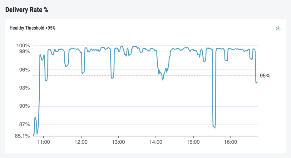
-
A consistently high delivery rate (over 95%) indicates your emails are reliably reaching recipient servers.
-
Spikes or drops may signal delivery problems, such as increased bounce or drop rates, or changes in recipient behavior or infrastructure.
-
Lower rates during specific timeframes may result from issues with your sending list, message content, or recipient servers.
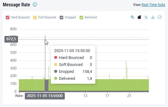
Message Rate
The Message Rate chart shows the distribution of email activity, helping you understand message volume and delivery outcomes over time. It combines all accepted emails into stacked bars, with each status represented by a different color. This chart is especially useful for teams sending in hourly batches or managing time-sensitive campaigns.
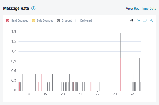
By default, the Delivered traffic is hidden to improve chart readability. The height of each bar reflects the total number of messages processed during each period, allowing you to:
-
Identify periods of high or low traffic
-
Visualize how failures (bounces, drops) affect total volume
-
Compare delivery success rates across different times of day
Investigating Delivery Issues
If unusual patterns appear in the dashboard:
-
Select an appropriate timeframe to focus on the affected interval.
-
Review metric cards for elevated bounce or drop rates.
-
Use the charts to pinpoint when issues began or how they progressed.
-
Open Reporting by clicking a status or event category.
-
Review SMTP response codes to identify the underlying cause.
-
Correlate patterns with campaign activity or sending list changes.