
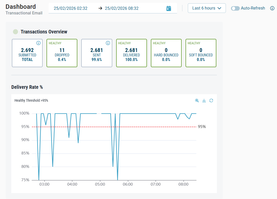
Charts on dashboards provide a visual and interactive way to explore activity and performance within the selected timeframe. They help you identify patterns, compare outcomes, and investigate unusual trends. While each product displays its own metrics and status types, the chart features and interactions described here are shared across all dashboards.
Selecting a timeframe
At the top of the dashboard, you can select the time range for the charts and metric panels. The selected timeframe applies to all charts displayed on the dashboard.
Quick Ranges
The quick range dropdown offers predefined options such as Today, Last 30 minutes, Last 1 hour, and so on.
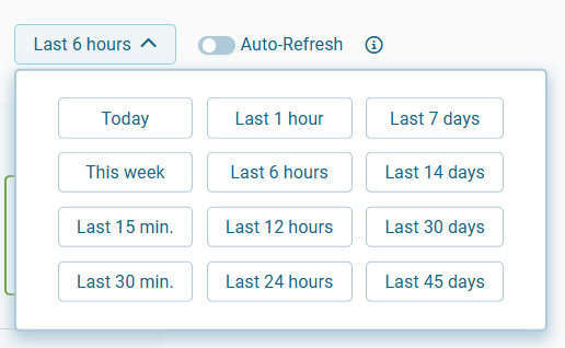
Quick ranges are recommended for routine monitoring and support auto-refresh.
Custom date & time range
Selecting the date picker icon opens a dialog where you can manually set a start and end date, including a specific time. This allows you to focus on precise intervals when analyzing historical activity.
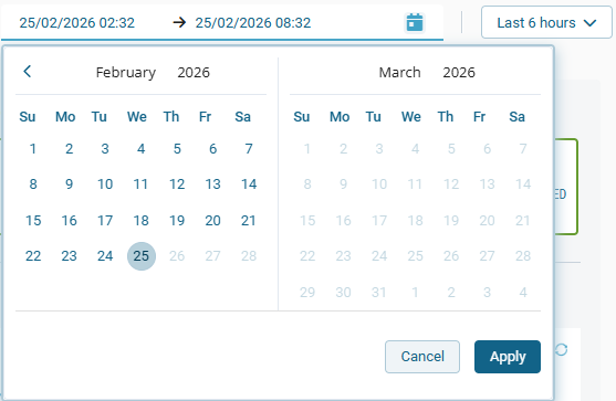
Use Apply to confirm your selection or Cancel to close the dialog without changes.
Auto-refresh
Auto-refresh updates charts and metric panels automatically when a quick range is selected.
This is useful for continuous, real-time monitoring during periods of high activity.
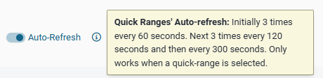
Auto-refresh follows a predefined schedule:
-
First 3 refresh cycles: every 60 seconds
-
Next 3 cycles: every 120 seconds
-
Afterwards: every 300 seconds
Auto-refresh is not available when using a custom timeframe.
Chart types and controls
Charts include several interactive controls that help you explore data more effectively and focus on specific areas of interest.
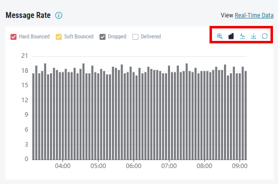
Zoom
Select the magnifying glass icon ![]()
Click and drag over the desired area to focus on that interval.
Chart type switch
Depending on the chart, you can toggle between line view ![]()
![]()
Download
The download icon ![]()
Reset view
Use the reset icon ![]()
Legend and metric visibility
Charts include a legend that displays the available status categories for the selected product (for example, Hard Bounced, Soft Bounced, Dropped, and Delivered for Transactional Email). Each category is shown with a corresponding color.
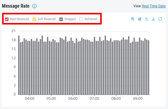
You can:
-
Click a metric to show or hide it
-
Combine multiple metrics for comparison
-
Focus on a single metric by hiding others
This helps reduce visual clutter and isolate specific status types.
Hover details
When you hover over a data point on the chart, a tooltip appears showing:
-
The exact timestamp
-
All relevant metrics at that time
-
The value for each metric
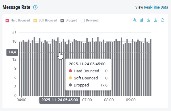
This allows for precise analysis of traffic spikes, drop-offs, or anomalies.
Displayed metrics and chart values
The dashboard retrieves metrics from Retarus monitoring systems and shows them in fixed time intervals (for example, every 15 minutes). To keep the dashboards fast and scalable, the system may interpolate or extrapolate data, depending on when you run a query and which data is available. This helps you see trends quickly and clearly.
Keep the following in mind:
-
Small differences can appear between the displayed values and the exact underlying counts because of metric sampling, aggregation, or approximation. Shorter time ranges usually contain fewer data points, which increases statistical variance.
-
You should expect these differences. They do not indicate data loss or errors in the underlying systems.
-
The displayed metrics support trend analysis and operational decisions. Do not use them for exact reconciliation, compliance, or accounting.
-
For exact totals or authoritative records, always refer to your defined source-of-truth reporting or accounting systems for each product.
-
Retarus continuously improves monitoring and calculation methods to keep data quality and reliability high across all product dashboards.
Why do some graph values show decimal numbers?
You may see decimal numbers in graphs, even when the underlying metric looks like it should be a whole number (for example, a request counter). This is expected.
Prometheus and PromQL often work with averages, rates, and other calculated values over time, not just raw counts. Because of this, values are usually computed as decimals (floating-point numbers) instead of integers.
Product-specific metrics
All dashboards use a common set of chart interactions and controls. However, each product has its own:
-
Status categories
-
Metric types
-
Data interpretations
For detailed information about the metrics used by each product, see: